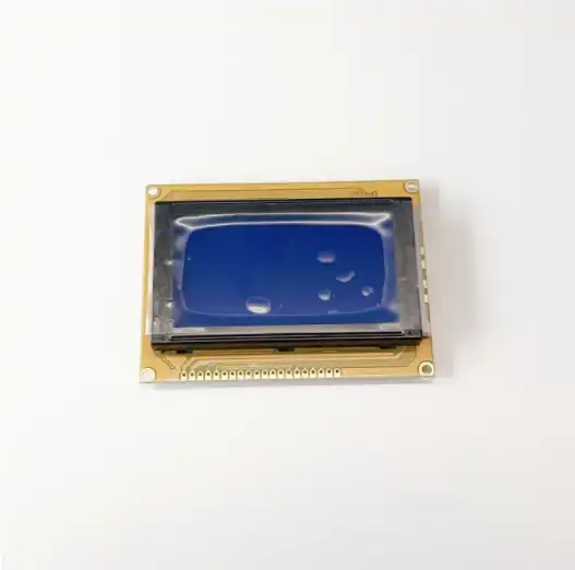
Vending machine touch screen interface
2024-09-10 15:44:56
Vending machine touch screen interfaces in vending machines offer numerous advantages over traditional button-based systems, They provide greater flexibility allowing for easy updates to product offerings and pricing without the need for physical modifications.
User Experience Design
At the heart of an effective vending machine touch screen interface lies thoughtful user experience UX design, This discipline focuses on creating interfaces that are not only visually appealing but also intuitive efficient, and satisfying to use, The goal is to design an interface that allows users to complete their desired actions with minimal effort and maximum enjoyment.
One of the fundamental principles of UX design for vending machine touch screens is simplicity. The interface should be clean and uncluttered, presenting only the information and options that are necessary for the user to make a purchase. This means avoiding overwhelming users with too many choices or unnecessary details at once ,Instead information should be presented in a logical step-by-step manner guiding the user through the purchasing process.
Consistency is another crucial aspect of UX design for touch screen interfaces, Using consistent design elements colors, and layouts across different screens helps users quickly understand how to navigate the interface and where to find the information they need, This familiarity reduces cognitive load and makes the interaction feel more natural and effortless.
Feedback is an essential component of good UX design, Every user action should be accompanied by a clear visual or auditory response.This could be as simple as a button changing color when pressed or a subtle sound effect confirming a selection. These feedback mechanisms reassure users that their actions have been recognized and help prevent errors.
Accessibility is an increasingly important consideration in touch screen interface design, Ensuring that the interface is usable by people with various abilities including those with visual impairments or limited motor skills, not only expands the potential customer base but also demonstrates social responsibility. This might involve features such as high-contrast color schemes adjustable text sizes or voice guidance options.
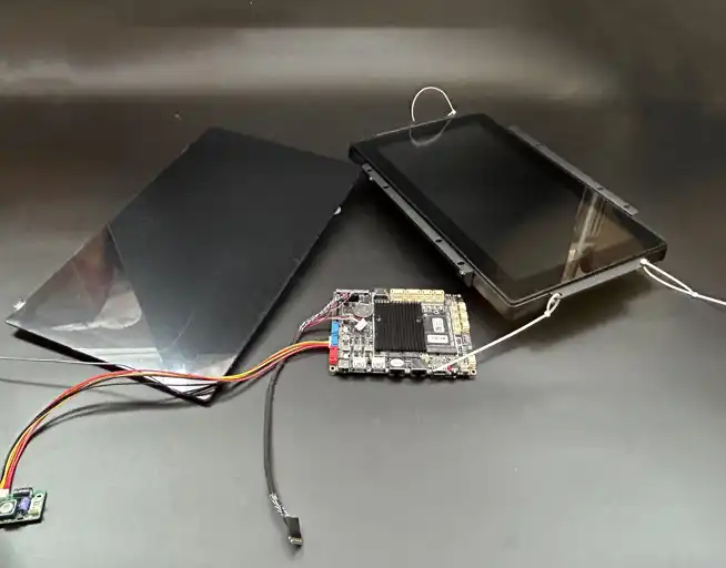
Visual Hierarchy
Visual hierarchy plays a crucial role in touch screen interface design for vending machines, It refers to the arrangement and presentation of elements on the screen in a way that guides the user's attention to the most important information and actions. This is particularly important in a vending machine context where users typically want to make quick decisions and complete their purchases efficiently.
Color is a powerful tool for establishing visual hierarchy. Bright vibrant colors can be used to highlight key elements such as the Add to Cart button or special promotions, Conversely, more subdued colors can be used for less critical information or background elements. It's important to use color judiciously however as an overly colorful interface can become visually overwhelming and confusing.
Contrast is another effective technique for guiding user attention, High contrast between text and background colors ensures readability while contrasting sizes shapes, or colors can make important elements stand out.For example, a large brightly colored Buy Now button will naturally draw the users eye making the final step of the purchase process clear and easy to complete.
Layout also plays a significant role in the visual hierarchy, The most important elements should be positioned prominently typically at the top or center of the screen where they are immediately visible. Less critical information can be placed towards the bottom or sides of the screen or even hidden in expandable sections. This approach helps prevent information overload and allows users to focus on the most relevant details.
The use of white space or negative space is another important aspect of visual hierarchy. Adequate spacing between elements helps to create a clean uncluttered look and can make individual items stand out more clearly,This is particularly important on touch screens where users need to be able to accurately tap on specific elements.
Interactive Elements
Interactive elements are the building blocks of any touch screen interface. They are the components that users directly manipulate to navigate the interface make selections and complete actions, In the context of vending machine touch screens these elements need to be designed with particular attention to ease of use and error prevention.
Buttons are perhaps the most common and important interactive elements in a vending machine touch screen interface. They should be large enough to be easily tapped even by users with larger fingers or less precise motor control . The design of buttons should clearly indicate that they are interactive often through the use of shadows depth or hover effects, Clear labels or icons on buttons help users understand their function at a glance.
Icons can be an effective way to convey information quickly and intuitively especially when space is limited, However its important to use universally recognized icons or to provide text labels alongside them to ensure clarity, For example, a shopping cart icon is widely understood to represent a users selected items but a more obscure icon might need an accompanying text explanation.
Sliders can be useful for allowing users to make adjustments or selections along a continuous range, For instance, they might be used to set the quantity of a product or to filter products by price range. Sliders should provide clear visual feedback as they are manipulated and should be designed to be easily grabbed and moved even on smaller screens.
Drop-down menus can be an efficient way to present multiple options without cluttering the interface, They work well for selections like product categories or payment methods. However, it's important to ensure that the drop-down options are easy to tap and that the currently selected option is clearly visible.
Search bars are becoming increasingly common in vending machine interfaces, especially those with large product catalogs, They allow users to quickly find specific items without having to navigate through multiple categories. The search function should be robust enough to handle misspellings and should provide relevant suggestions as the user types.
Vending Machine Touch Screen Wholesale
Topping Motor has more than 10 years of experience Connectivity is Wi-Fi and Bluetooth,If you are choosing your Vending Machine Touch Screen manufacturers welcome to contact us at sales@huan-tai.org.
References
1. Nielsen Norman Group. "Touch-Screen User Interface Design Best Practices."
2. UX Booth. . "Designing for Touch: The Art of Creating Intuitive Interfaces."
3. Smashing Magazine. "Visual Hierarchy in UI Design: Principles and Best Practices."
4. Interaction Design Foundation. "The Principles of Interactive Design for Vending Machines."
5. Journal of Usability Studies. "User Experience in Self-Service Technologies: A Study of Vending Machine Interfaces."
Send Inquiry
Related Industry Knowledge
- What is the replacement cycle of the Coffee Machine O Rings?
- Commercial Coffee Machine Spare Parts List
- What is a volumetric counter?
- How Does Boiler Size Affect Coffee Machine Performance?
- What Are the Most Commonly Replaced Coffee Vending Machine Spare Parts?
- Are Coffee Grinder Motors Waterproof or Water-Resistant?
- How Do You Clean a Plastic Coffee Hopper?
- Do espresso machines have built-in grinders?
- What Is a Hopper on a Coffee Machine?
- What Are Coffee Vending Machine Ingredient Canisters Made Of?

.webp)

